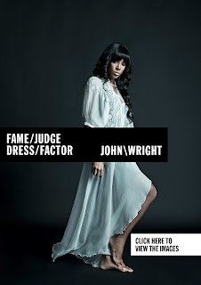
Once again, pursuing research in terms of design branding as citied as inspiration for student photographer, Jessie Leong, for whom I am writing one of my negotiated briefs to work on upon throughout the first half of this academic year.
Again, the branding for photographer John Wright is very distinctive of Jessie's personal taste, with bold, uppercase, sans serif, monochromatic type which shows a confidence within the photographers portfolio whilst still remaining quite clean and universal, letting the images, literally, do the talking in terms of the brand and identity.
From the images below, the typographically- influenced branding is shown as effective throughout a range of both print and digital media, which is something I really aspire to in designing Jessie's branding, and hope that the bold visual identity can be as effective as some of the examples I have recently blogged and researched, as well as the examples here shown for John Wright.
Image Source
Image Source
Image Source


No comments:
Post a Comment